Ranker's Academy
JEE/NEETcoaching,faculty-first.
One of Punjab's top JEE/NEET coaching institutes, rebuilt around the people students actually sign up for.

Stack
- Next.js
- TypeScript
- Tailwind
- Schema.org
- Responsive
- Single-page IA
Results
The brief
Problem
Coaching-institute websites drown in course lists, marketing banners, and stock photography. The real buying decision — for a parent in Jalandhar evaluating their kid's shot at JEE Advanced — is about the results the institute can name, the people behind those results, and whether the proof would survive a phone call to verify. Ranker's old site made that proof hard to find.
How we built it
Approach
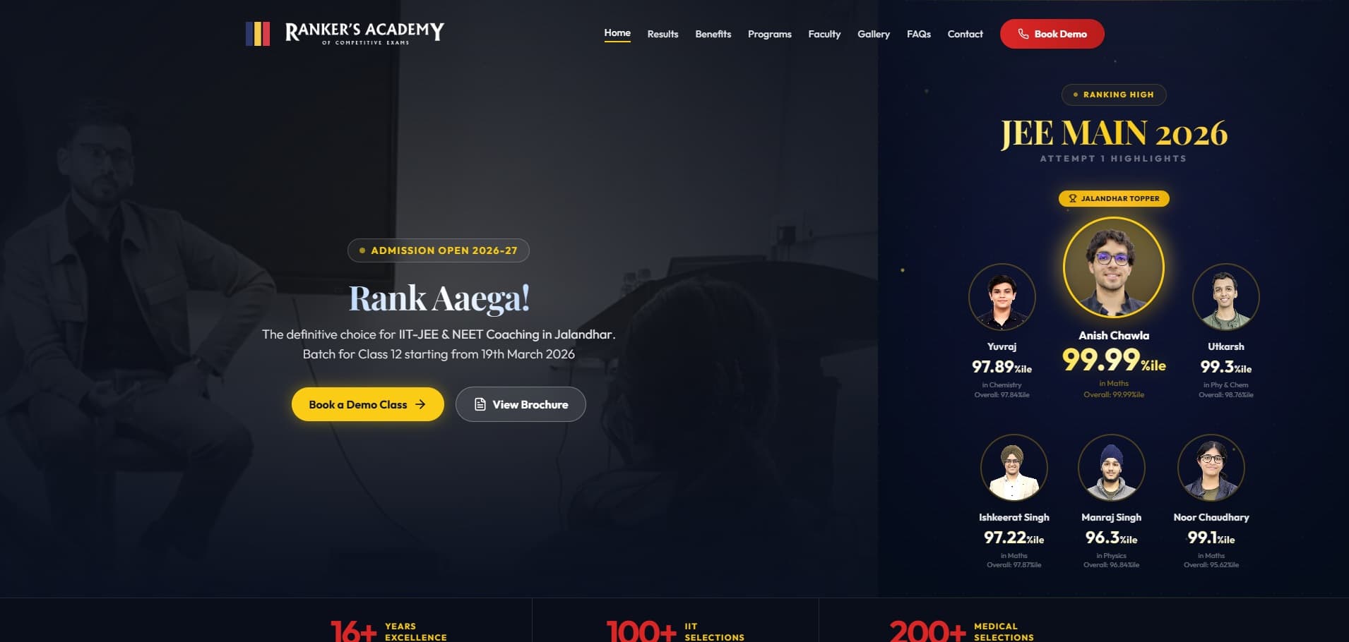
A single, narrative-rich homepage that lets a parent evaluate the institute in one continuous scroll — opening under the institute's 'Rank Aaega!' promise with the JEE Main 2026 attempt's percentile board (named students, real photos, verifiable scores), then a benefits section, then the programs and faculty as anchored sections, then a results wall, then contact. Anchor navigation rather than separate pages, so the buying decision happens on one surface without context loss. A dedicated `/faqs` page handles the long-tail parent anxieties. Mobile-first everywhere, because this site gets opened at 10pm on a parent's phone before tomorrow's decision.
Feature showcase
The bits worth zooming into.

Topper testimonials
'Alumni Voices' — video testimonials you can press play on, from named, verifiable students (Anish Chawla 99.99%ile JEE Main, Ramanpreet Singh → IIT Kharagpur, Abhay Khosla AIR-1044) over a wall of IIT-stamped results. Proof, not stock praise.

Life at Ranker's
A live campus-life feed (@learnatrankersacademy) — classrooms, doubt sessions, results-day energy — so a parent sees the place their child would actually study, not a stock prospectus.
Decision log
What we decided, and why.
01
Why a single-page architecture, not a multi-page site
Parents arriving at a coaching-institute site don't want to navigate — they want to evaluate. We collapsed the institute story into one continuous scroll: results → benefits → programs → faculty → results wall → contact. The buying decision happens on one surface, in one session, without losing context to a page load. The only off-homepage page is `/faqs`, which earns its separation by handling the long tail of parent anxieties.
02
Why named, photographed results lead the page
Testimonials with blurred faces and generic praise are invisible noise in this category. Ranker's homepage opens with the JEE Main 2026 attempt's named percentile board — Anish Chawla 99.99%ile (Jalandhar topper), Ishkeerat Singh 97.22%ile, Noor Chaudhary 99.1%ile, with their photos. Verifiable, dated, scrutinisable. That panel does the work an entire 'About' section can't.
03
Why we accepted a heavier LCP for the trust trade-off
The hero carries six student photos plus institute photography above the fold — that's a real LCP cost. The alternative (text-only hero with photos lazy-loaded below) would have scored better but undercut the entire trust thesis of the site. We chose the trade-off explicitly. CLS is held at 0.002 so the trust panel never jumps under a reader.
Common questions
What buyers ask before signing.
- Q01How do you differentiate an education website in a category dominated by content volume?
- By collapsing the entire institute story onto one continuous-scroll homepage and leading with named, photographed results. Competitors surface course lists and marketing banners first. We surface the latest exam's toppers, their percentiles, their photos. The single-page IA means the buying decision happens in one session, on one surface.
- Q02How do you structure content for ongoing result publishing?
- Results are a typed content model with attempt, year, student, percentile, subject. New attempts append to the results board on the homepage and the results wall section without manual layout work; the typed model means each entry inherits the photo + scrutinisable-data treatment by default.
- Q03Why a single-page architecture for an education brand at this scale?
- Because the buying decision is one decision, made in one session, often at 10pm on a parent's phone. Splitting that journey across faculty / courses / results / about pages introduces friction without solving any actual user need. The exception is /faqs — it's a separate page because the parent anxieties it answers are reference reading, not part of the evaluation flow.
Related work
More from the education shelf.
Education · 2024
NK Education
30+ years of expertise, 5,000+ successful visas, 400+ university partners — on a site a parent can trust in thirty seconds.
Read case studyEducation · 2026
Maths with Vipul Sir
A personal-brand site for a Jalandhar JEE-maths teacher — anchored by a working college-predictor tool, not a brochure.
Read case studyEducation · 2026
NK Education — Lead Management
A bespoke lead-management CRM for NK Education — every Meta-Ads enquiry, counsellor note, and visa stage in one internal product the whole team lives in.
Read case study