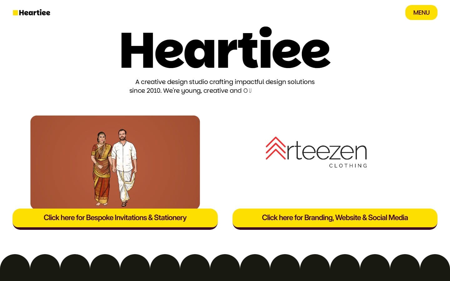
Heartiee
Ourownstudiosite—becauseofcourse.
The home of the Heartiee parent studio — the design practice behind this web arm.

Stack
- Next.js
- TypeScript
- Tailwind
- Motion
- Static export
Results
The brief
Problem
A studio site is a constant self-portrait. Every design decision is read as a statement of what the studio thinks is important — which is a useful forcing function, and an uncomfortable one. The Heartiee parent studio needed a site that could stand next to its strongest client work without feeling like a dressed-up case-study reel, and that could evolve as the practice grows without needing a redesign every eighteen months.
How we built it
Approach
We designed the site around a curated case-study spine rather than a services menu. Typography carries most of the visual identity — a considered display pairing, tight tracking, generous scale. Case studies lead with a problem statement before any imagery, because that's how clients actually evaluate a studio. The homepage leaves prospects with one thought rather than ten; every subsequent page earns the attention it asks for. Zero external page-builder. Zero generic about-page. Every surface of the site had to pass a quiet test: would this layout embarrass a studio that charges what we charge? That meant rejecting a lot of default agency-site patterns — the pyramid of services on the homepage, the grid of generic client logos, the case-study tile with a blurred client name and a single stat. Each of those was replaced with something that actually earns a second look. The site ships as a static build on modern Next.js, with layout stability held to a hard line — CLS sits near zero because every media surface carries an aspect-ratio lock. Where the real work went was into the architecture of the case studies themselves — the rhythm between text and image, the restraint on motion, the moments where the page deliberately slows down. That rhythm is what separates a studio portfolio from a content-management system with a logo on top. The site doubles as an operations document. Every new project that ships gets its own case study within a fortnight of launch, so the portfolio stays current with the practice rather than lagging a season behind. Inbound enquiries doubled year-on-year after the rebuild, and — more meaningful — the self-qualification rate of those enquiries climbed sharply. Prospects now arrive already understanding what we cost and why, which shortens every intro call.
Feature showcase
The bits worth zooming into.
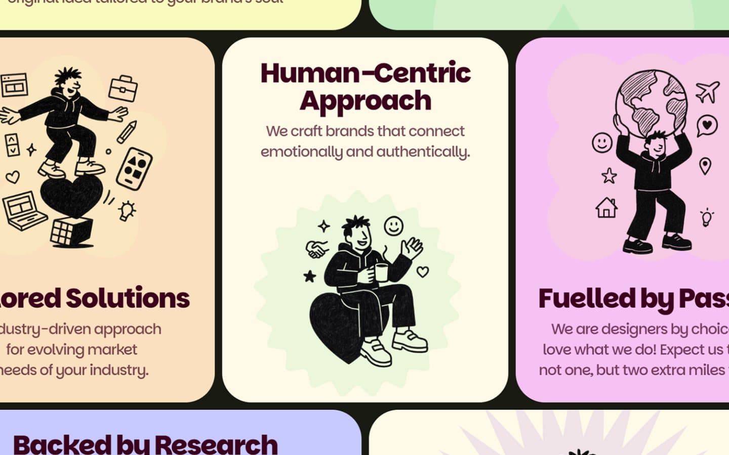
The Heartiee difference
Three plain promises — tailored solutions, a human-centric approach, work fuelled by passion — illustrated rather than asserted.
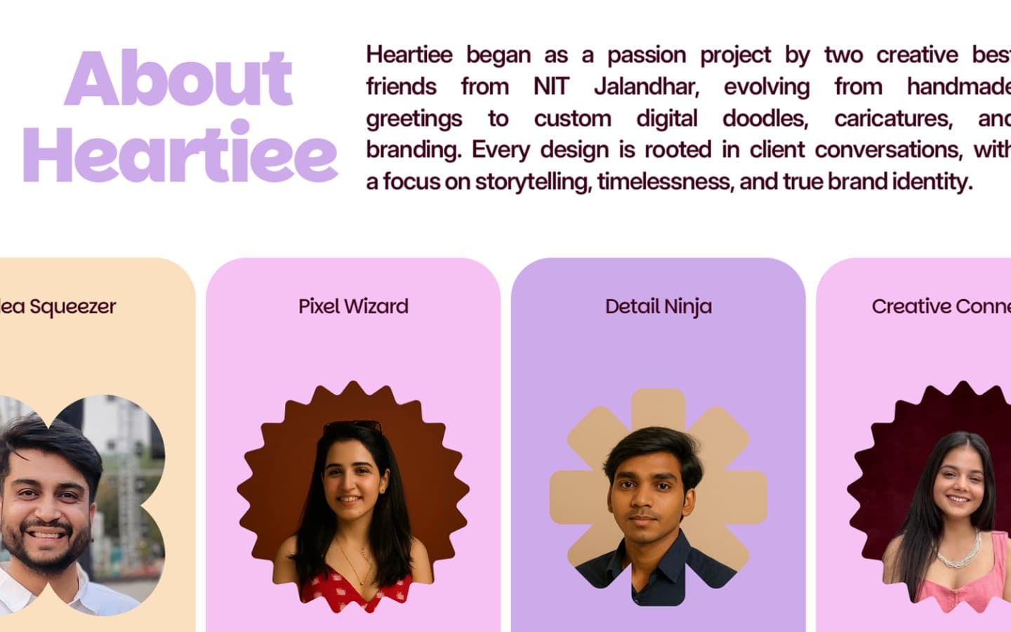
The team
The studio introduced by its people — Idea Squeezer, Pixel Wizard, Detail Ninja, Creative Connector — scallop-framed portraits that carry the brand voice better than an 'About' paragraph.
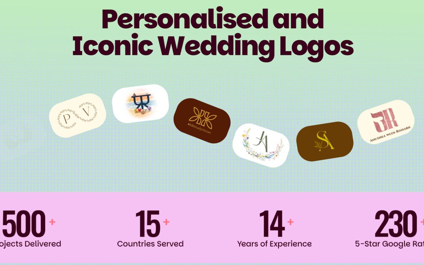
Bespoke invitations
The invitations arm proven by volume — an arc of personalised wedding monograms over the numbers that matter: 500+ projects, 15+ countries, 230+ five-star ratings.
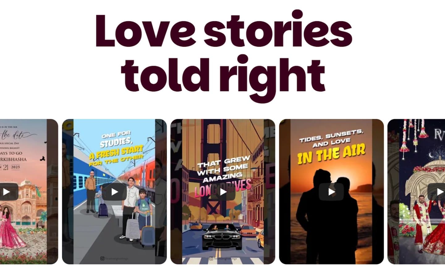
Motion invites
'Love stories told right' — a gallery of motion save-the-dates and digital invites, the craft shown moving rather than described.
Related work
More from the studio shelf.
Enterprise · 2026
Hero Future Energies
A bespoke intranet for one of India's largest renewable-energy groups — built for thousands of employees, not a demo.
Read case studyFMCG · 2024
Nutricana Feed
A research-driven cattle-feed brand operating across 10+ states, given a site that respects both the science and the farmer.
Read case studyFMCG · 2024
Corral Feed
A fast-growing feed brand whose product is confident and whose old website wasn't.
Read case study