Corral Feed
Wholesomenutrition,premiumsite.
Family-run cattle & buffalo feed, trusted by 5,000+ farms since 2007 — rebuilt warm, trilingual, and trust-first.

Stack
- Next.js
- TypeScript
- Tailwind
- Motion
- Responsive
Results
The brief
Problem
Cattle-feed sites in this category all blur together — a stock herd photo, a grid of product tabs, nothing that earns a farmer's trust over the next supplier. Corral has the opposite of a generic story: it started in a family cattle shed in Shahkot in 2007 and now feeds 5,000+ farms across six states — but the old site buried that heritage. They needed a face a dealer or farmer could trust at a glance, in the language they actually read.
How we built it
Approach
Lead with the relationship, not a product grid: a warm hero of a farmer with his herd under a 'Feed the Future' promise, wrapped in heritage cues — 'Since 2007', 'Wholesome Nutrition', 'Trust & Quality'. The About page is told as a family story — 'started in our own cattle shed; now feeding 5,000+ farms.' The full line — 11 SKUs across Calf & Heifer, Milking Feed and Transition & Dry — sits on a single /products surface with a live detail pane, so a buyer comparing a calf starter and a milk feed never loses context. Real farmer success stories (milk up 15%, faster calf weight gain) carry the proof. And the whole site reads in English, Hindi and Punjabi — because a buyer in a Punjab mandi shouldn't have to translate.
Feature showcase
The bits worth zooming into.
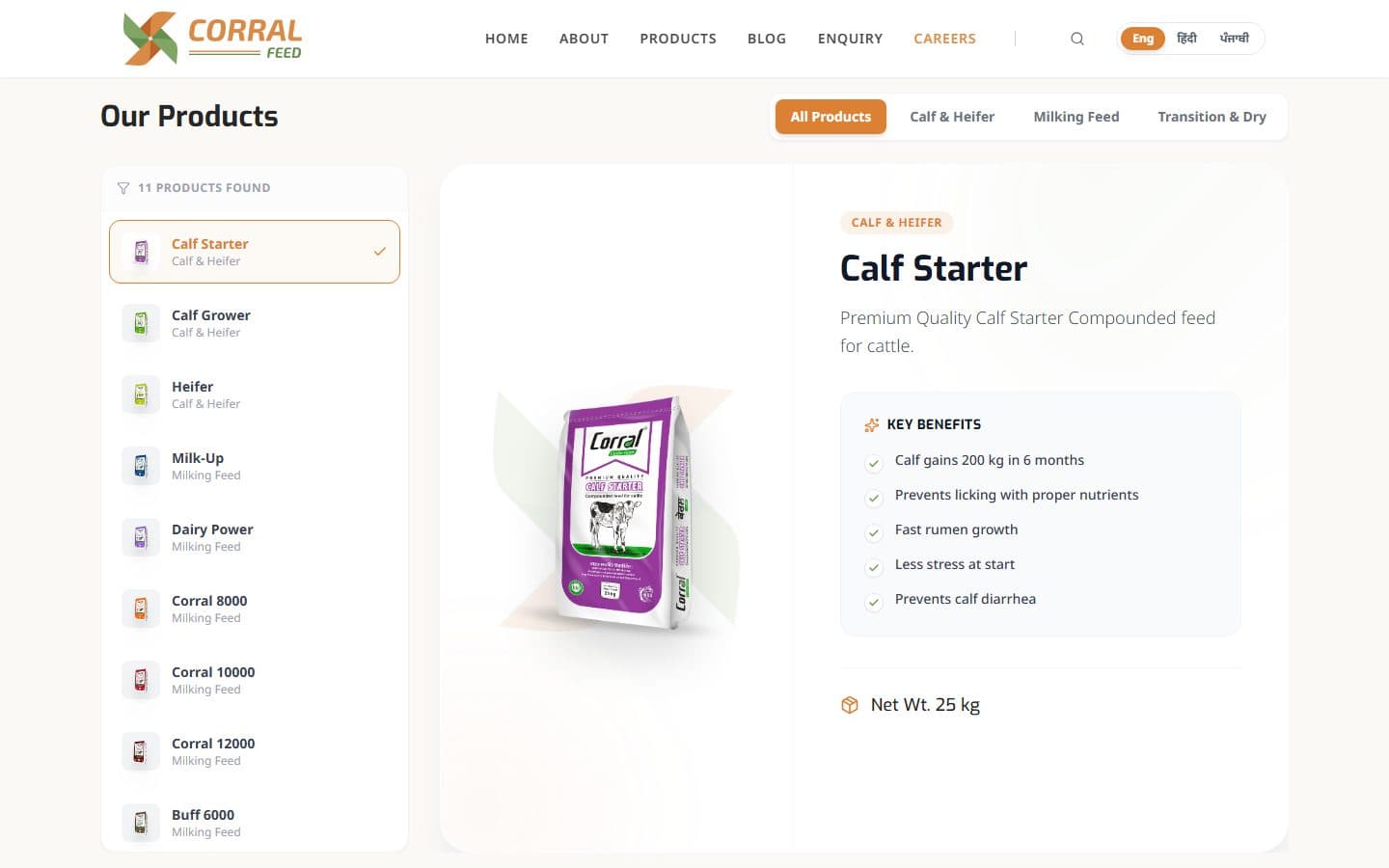
Product catalogue
Single-canvas catalogue: every SKU surfaced on /products with category filters (Calf & Heifer, Milking Feed, Transition & Dry) and live detail pane.
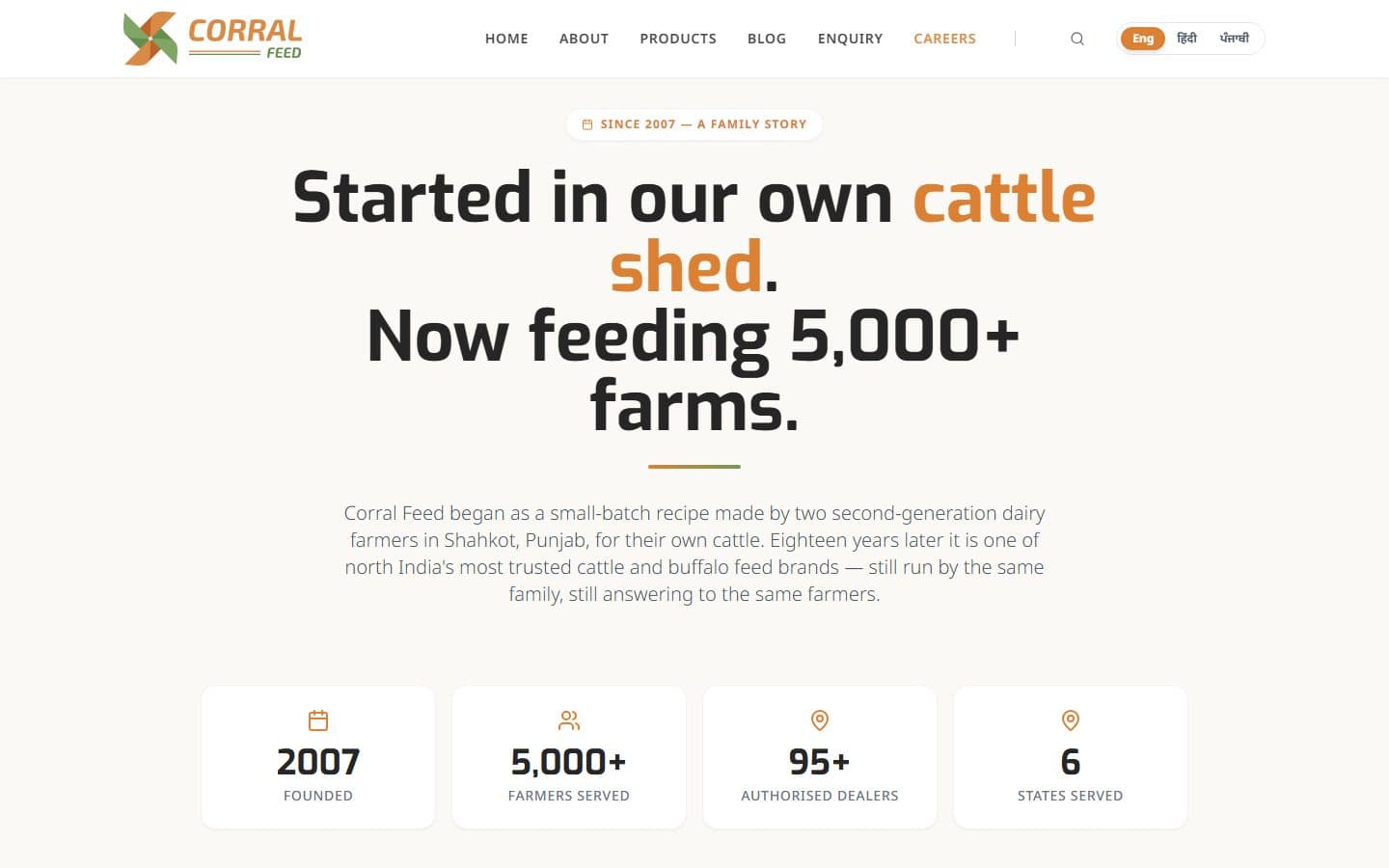
About
A family story, not corporate boilerplate — 'started in our own cattle shed in 2007, now feeding 5,000+ farms,' anchored by founded / farmers / dealers / states stats.
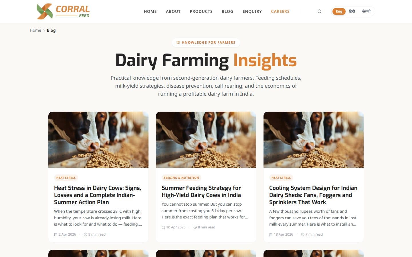
Blog
Structured as a field manual for dealers, not a press-release archive.
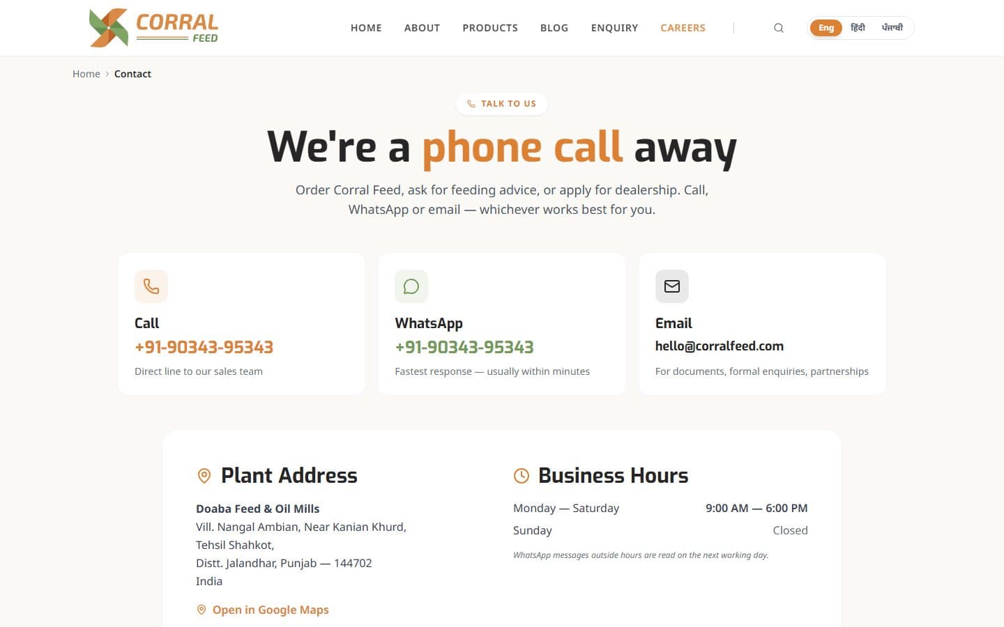
Contact
Distributor-first flow — short, sticky, tolerant of a flaky mandi connection.
Decision log
What we decided, and why.
01
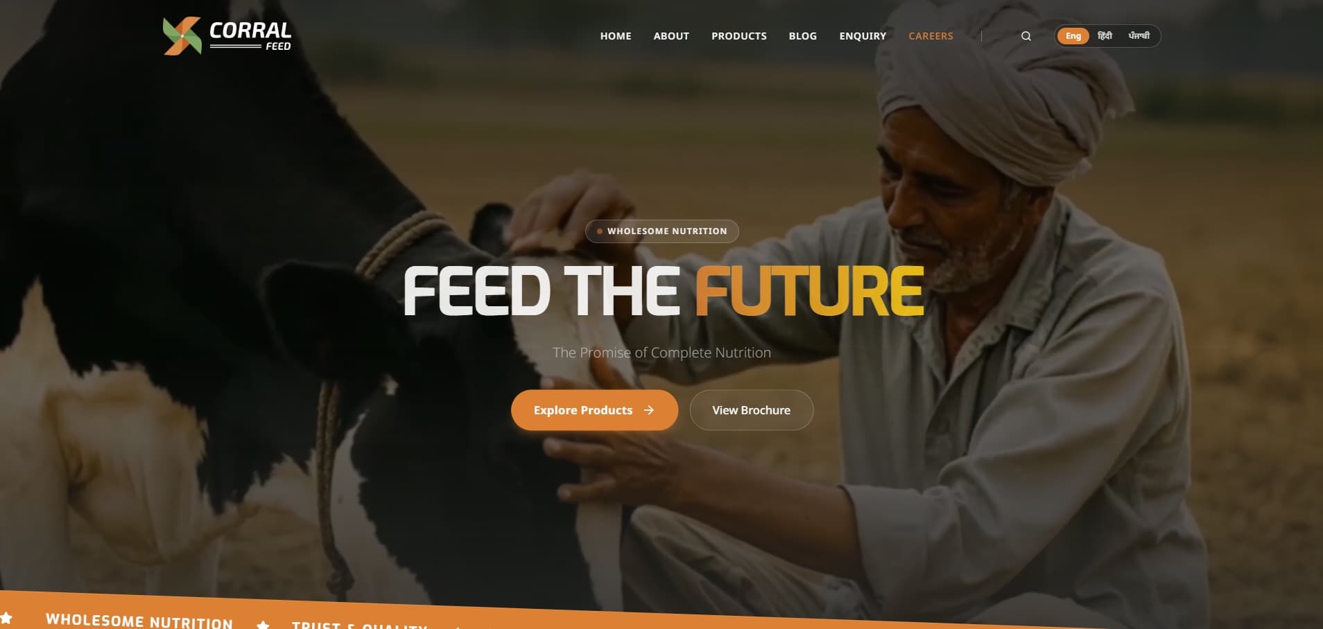
Why the hero leads with the farmer, not the sack
In a low-trust category, the differentiator isn't another product render — it's whether a farmer believes this brand actually knows cattle. So the homepage leads with a farmer and his herd under a 'Feed the Future' promise, and the About page opens as a family story (two second-generation dairy farmers, a cattle shed in Shahkot, 2007). Product photography earns its place on the catalogue — where the buyer is deciding which feed — not on the homepage, where they're deciding whether to trust you at all.
02
Why a single catalogue page with category filters
Splitting catalogue by species (separate cattle-feed and buffalo-feed pages) felt structurally tidy on paper but added clicks for buyers who actually wanted to compare options across species in one session. We collapsed everything into a single /products surface with persistent category filters and a live detail pane — every SKU stays one click away, regardless of where the buyer started.
03
Why the distributor form is short and sticky
The realistic context for a dealer enquiry is a phone in a mandi with a flaky connection. The form is three fields, stores partial state locally, and reconciles on network reconnect. The longer 'full enquiry' flow lives on a separate page that buyers opt into after first contact.
Common questions
What buyers ask before signing.
- Q01How do you differentiate a feed brand's website in a saturated category?
- Not by chasing a flashier hero image — every rival has one. By leaning into what rivals can't fake: a real family heritage (since 2007, still run by the same dairy-farming family), proof in farmers' own words (milk up 15%, faster calf weight gain), and a site that speaks the buyer's language literally — English, Hindi and Punjabi.
- Q02What's the content model for a catalogue like this?
- Each product is a typed record with formulation, species, lifecycle stage, and related-product relationships. The site reads from that data model, so editorial changes don't require template tweaks and new SKUs inherit the system automatically.
- Q03How does the site handle dealer onboarding vs consumer enquiry?
- Two paths. Consumer / brand enquiries route through the main contact flow. Dealer onboarding (pricing, MOQ, territory) is a gated path with a separate form and a follow-up cadence designed for a B2B sales cycle.
Related work
More from the fmcg shelf.
FMCG · 2024
Nutricana Feed
A research-driven cattle-feed brand operating across 10+ states, given a site that respects both the science and the farmer.
Read case studyFMCG · 2024
Satkar Feed
A legacy feed brand re-introduced to a digital-first distribution channel.
Read case studyEnterprise · 2026
Hero Future Energies
A bespoke intranet for one of India's largest renewable-energy groups — built for thousands of employees, not a demo. Screens shown are blurred under NDA.
Read case study