Dr. Mohak Kataria
Asurgeon'ssite,readlikeareputation.
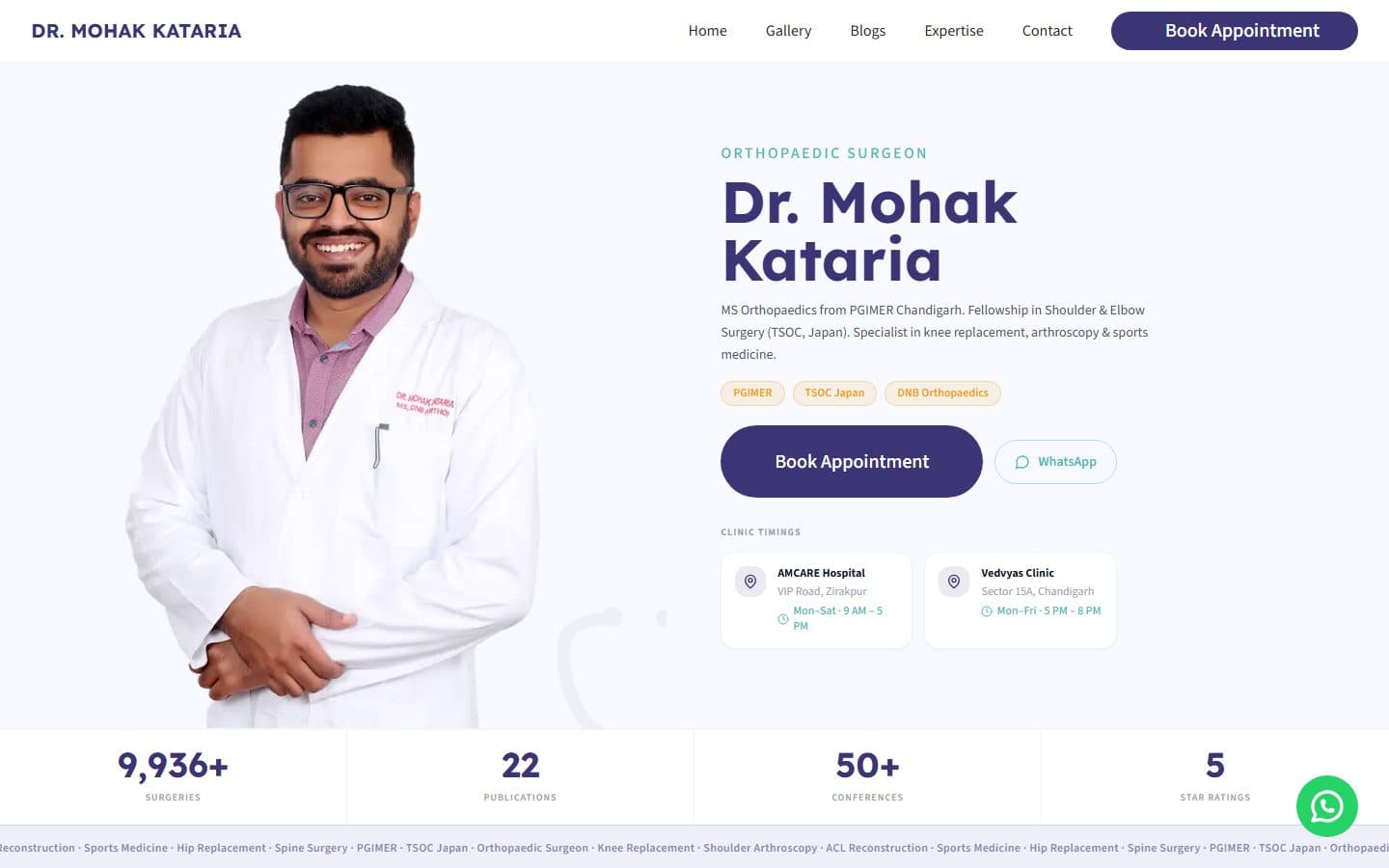
A personal-brand site for a Chandigarh orthopaedic surgeon — MS (PGIMER), TSOC-Japan fellowship, 9,936+ surgeries — built so the proof lands before the first line of copy.

Stack
- Next.js
- TypeScript
- Tailwind
- Editorial design
- Accessibility
Results
The brief
Problem
Most doctor websites are indistinguishable: a stock medical photo, a tab for 'services', a generic 'about' and a form. For a surgeon whose reputation rests on outcomes that patients spend weeks evaluating, that template actively undermines credibility. Dr. Kataria needed a site that reflected the standard of care itself — one that signalled expertise before the first sentence of copy was read.
How we built it
Approach
We built the site to do in five seconds what a referral does in a sentence — establish that this is a serious surgeon. The hero leads with the proof a patient actually weighs: MS Orthopaedics from PGIMER Chandigarh, a Shoulder & Elbow fellowship at TSOC Japan, DNB Orthopaedics, and a hard track record — 9,936+ surgeries, 22 publications, 50+ conferences, a five-star patient rating — before a word of marketing. Specialties (knee replacement, arthroscopy, sports medicine) and both clinic locations with live timings sit right alongside, so a patient can evaluate and book in a single glance. The structure reflects how patients actually arrive. A referred patient knows a procedure name; a self-directed one arrives with a symptom. The IA serves both — procedures are browsable directly, but also reachable from a symptom-first path that routes the reader to the right consultation without the page feeling like a search engine. Patient journeys are written as considered, long-form narratives rather than testimonial snippets, because a thoughtful patient is rewarded with depth, not patronised with brevity. Every photograph is of the practice and the surgeon himself — no stock clinic, no generic surgeon-in-scrubs, which in this category is exactly the tell that erodes trust. The build is mobile-first, because most of this traffic is a patient researching on a phone, with layout stability held to a hard line — CLS sits at 0.011, so the credibility panel never jumps under a reader mid-scroll. Booking and a one-tap WhatsApp sit within reach from anywhere on the page.
Feature showcase
The bits worth zooming into.

Orthopaedic expertise
The clinical range laid out as a scannable grid — joint replacement, knee & shoulder arthroscopy, spine, complex trauma — so a referred patient finds their procedure in one pass.

Practice gallery
A real-photography grid from theatre and clinic — the surgeon at work, never stock — because in this category authentic imagery is the trust signal.

Patient education
A patient-education library, not a press feed — bylined, categorised articles answering the questions a patient actually researches before booking.
Related work
More from the healthcare shelf.
Enterprise · 2026
Hero Future Energies
A bespoke intranet for one of India's largest renewable-energy groups — built for thousands of employees, not a demo. Screens shown are blurred under NDA.
Read case studyFMCG · 2024
Nutricana Feed
A research-driven cattle-feed brand operating across 10+ states, given a site that respects both the science and the farmer.
Read case studyFMCG · 2024
Corral Feed
Family-run cattle & buffalo feed, trusted by 5,000+ farms since 2007 — rebuilt warm, trilingual, and trust-first.
Read case study