Marveluxx
Luxurytreatedlikecraft,notstock.
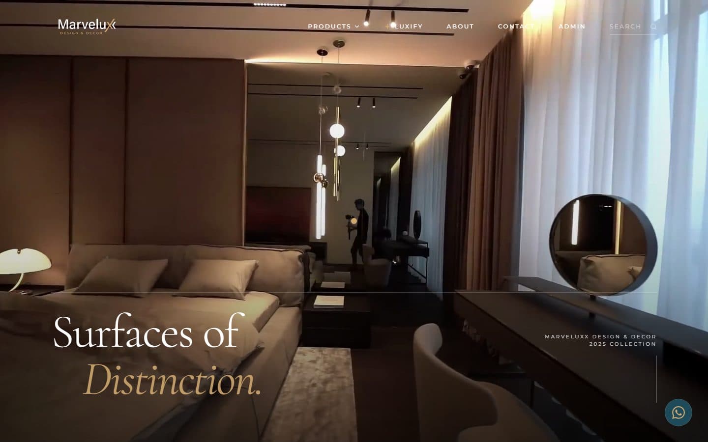
A premium commerce experience that carries the feel of the product through every pixel.

Stack
- Next.js
- TypeScript
- Tailwind
- Motion
- Commerce
Results
The brief
Problem
Luxury e-commerce in India is stuck copying mass-retail templates — the same grids, the same filter rail, the same checkout flow that a department store could run. Marveluxx needed a storefront that moved, paced, and breathed like a brand, not a catalogue. The brief included the checkout page, the cart drawer, and the PDP micro-interactions as first-class design surfaces — not afterthoughts to style later.
How we built it
Approach
We designed every page surface bespoke — no off-the-shelf Shopify theme, no page-builder shortcuts. The product detail page uses curated motion to reveal detail (fabric close-up, craftsmanship cues) as the shopper scrolls, instead of reserving those for a separate 'story' page nobody reads. The cart is a full-height drawer with typography that matches the PDP, not a utilitarian sidebar. Checkout is a bespoke three-step flow tuned for Indian payment patterns (UPI-first, EMI callouts surfaced early). Motion is restrained — used to guide attention, never to decorate. Category pages were re-thought around occasion, not SKU count. The traditional 'grid of forty products' layout performs poorly when the buyer is browsing emotionally; we replaced it with a curated shelf per collection, where copy sets context before the products are shown. Product photography is integrated into layout rather than sitting on top of it — white-space, type scale, and image cropping are design decisions per category, not a template variable. The technical stack prioritises first-visit performance on mobile 4G. The full shop ships without a heavy JS framework on the critical path; product pages pre-render with next/image optimised hero photography, and checkout is the only surface with meaningful client-side state. Layout stability was held to a hard line — CLS on the PDP, historically the worst offender on luxury sites, measures effectively zero because every media surface carries an aspect-ratio lock from the moment it's designed. Post-launch, the site has continued to iterate against real data rather than guesswork. Add-to-cart rates, drop-off points in checkout, and search-term patterns are reviewed monthly, and meaningful changes ship within a week of a hypothesis being formed. That cadence is only possible because the site is bespoke — template commerce platforms punish exactly this kind of iteration. Marveluxx treats the website as a conversion surface, not a brochure, and the design is built to support that stance over years.
Related work
More from the e-commerce shelf.
E-commerce · 2026
Annapurna Spices
A 33-year-old Rajpura spice house — a 180+ product range, FSSAI & AGMARK certified — rebuilt as a full D2C commerce platform, with a B2B dealer portal and 'MaAI', an AI health-and-recipe guide whose name means 'mother' in Hindi.
Read case studyEnterprise · 2026
Hero Future Energies
A bespoke intranet for one of India's largest renewable-energy groups — built for thousands of employees, not a demo. Screens shown are blurred under NDA.
Read case studyFMCG · 2024
Nutricana Feed
A research-driven cattle-feed brand operating across 10+ states, given a site that respects both the science and the farmer.
Read case study